
photo by Inês Gonçalves
Pedi a Ana Sabino, uma voluntária no AtypI para deixar aqui a sua visão do evento. No seu espírito voluntarista aceitou de imediato o desafio e enviou-me o seu contributo.
Obrigado Ana.
Ana Sabino was a volunteer at AtypI, I invited her to leave here her vision about AtypI Lisbon 2006. As any volunteer she acepted imediatly and sent me her text, links and photos.
Thanks Ana.
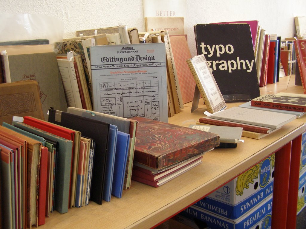 photo by Marisa Lourenço
"ATypI Lisbon 2006 - Typographical Journeys"
A primeira impressão causada pela semana do AtypI, observando a olho nu, foi a mistura inusitada que foi ter uma conferência talvez demasiado exclusiva (o preço deixou muito interessados de fora), dentro do ambiente informal a que já nos habituámos nas Belas Artes. Resultou, e muito bem. Os alunos interessados acabaram por poder assistir à maior parte das conferências, e sem dúvida que o bom ambiente de início de ano académico contagiou os participantes nas conferências.
Na livraria, houve a oportunidade única de termos contacto directo com uma quantidade enorme de livros apetecíveis, virtualmente todos imprescindíveis. Saber que eles existem é uma coisa, poder passar as mãos por eles é outra, e sabe muito bem. Agora só através da internet se pode visitar a Antiqvariat Morris sem ter que se apanhar um avião. Na internet está também a livraria que habitualmente está representada na ATypI, com excepção para este ano: a holandesa Nijhof & Lee, que é completíssima e vale a pena visitar.
Nos primeiros dias havia sempre alguma coisa a fazer para os voluntários, por isso acabei por não apanhar o Type Radio em pleno funcionamento, mas felizmente a oportunidade não ficou de todo perdida; há sempre o site para nos pôr a par.
Todas as exposições valeram a pena, não consigo destacar uma, excepto a da FBAUL, pelo prazer de ver trabalhos de colegas junto com trabalhos de profissionais estabelecidos. O mesmo posso dizer das conferências; havia praticamente para todos os gostos. Mesmo dentro desta elite, em que todos concordam que discutir a descendente da letra g é caso polémico, que pode acabar com cadeiras pelo ar, há pessoas diferentes e gostos variados, e isso confirmou-se. Desde o tipógrafo que veio da era do chumbo ao sangue novo de estudantes de tipografia de todo o Mundo.
Ellen Lupton surpreendeu no primeiro dia pela sua ausência, mas no dia seguinte pela profundidade da sua intervenção. Provou que é possível ser-se sensível tanto à curva interior da barriga de um "a" como a aspectos mais macroscópicos como o fenómeno das fontes gratuitas, analisado em tudo o que isso implica de mau e de bom. Um raciocínio a acompanhar.
Muito bom também foi ver portugueses, em bom número, e com projectos interessantes, como o inovador Type Forge.
No fundo o ATypI foi isto: uma submersão num conjunto de projectos inovadores, gente interessante, ideias novas, e mesmo ideias velhas a não esquecer. Uma semana em que cada amante de tipografia se afastou da sua secretária e mostrou aos outros o que andava a fazer. Um muito obrigada a todos os que trouxeram tudo isto para próximo de nós, nomeadamente Mário Feliciano, ExperimentaDesign, a Faculdade de Belas Artes. Se não acontecesse todos os anos, mas sim todos os meses, era melhor. Mas se calhar até é um factor aliciante não ser sempre assim tão perto...
Boas viagens tipográficas!
Ana Sabino
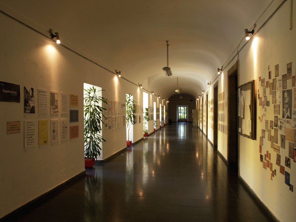
photo by Valter Fatia
"ATypI Lisbon 2006 - Typographical Journeys"
The first impression caused by ATypI's week, was the unexpected mixture of having a perhaps-too-exclusive conference (prices were a little prohibitive), inside the informal atmosphere to which we are already used to in Belas Artes. It worked, and very well. Interested students could ultimately attend to most conferences, and without any doubt the good mood of the starting of the academic year affected the conference participants.
On the bookstore, there was the unique opportunity to establish contact with a huge quantity of desirable books, virtually all of them indispensable. To know about them is one thing, to get to see and handle them is another, and it feels very good. Now only through internet we can visit Antiqvariat Morris without having to catch a plane. On the internet is also the bookstore usually represented in ATypI, except this year: the dutch Nihjof & Lee, which is very complete and is worth a visit. On the first days there was always something to do for the staff volunteers, so I didn't get to see Type Radio in action, but fortunately the opportunity is not completely lost; there's always the site to keep us up-to-date.
All the exhibitions were worth the while, I can't highlight one of them, except FBAUL's, for the pleasure of seeing schoolmate's works together with those of established professionals. I could say the same about the conferences; there was practically one for every taste. Even within this people, who all agree that arguing the descender of the letter g is quite polemic and can end up with chairs flying around, there are many different people and varied taste, and that was confirmed here. From the typographer that came from the lead age to the new blood of typography students from around the world.
Ellen Lupton surprised in the first day by her absence, but the next day by the depth of her intervention. She proved that it is possible to develop a sensitivity both to the inner curve of a letter a's bowl, and to more macroscopic issues, as the free font phenomenon, in all that it implies: bad and good. A train of thought to keep following.
It was also very nice to see portuguese people, quite a few, and with interesting projects, like the innovative Type Forge.
Bottom-line, that was ATypI: the submersion in a collection of innovative projects, interesting people, new ideas, and even old ideas not to be forgotten. A week in which each typography lover went away from his disk and showed the others what he's been doing. A deep thank you to everybody who brought this experience close to us, namely Mário Feliciano, ExperimentaDesign, the Fine Arts College. If it didn't happen every year, but every month, it would be better. But perhaps not being always so close can be a stimulating factor...
Have nice typographical journeys!
Ana Sabino
Vê mais fotografias | See more photos at :
http://picasaweb.google.com/mrscrs
Marisa Lourenço
http://picasaweb.google.com/Vfatia/Atypi?authkey=NQ9MpvBn4jgkSLFiRk-zO51KWjs
Valter Fatia
http://picasaweb.google.com/ines.design/StaffATypI
Inês Gonçalves de Azevedo
http://picasaweb.google.com/leonardo.xavier/ATypI2006LisbonStaff
Leonardo Xavier
http://www.fba.ul.pt/galeria/main.php
galeria da FBAUL | FBAUL Galleries (ainda não está completa / not complete)
Sem comentários:
Enviar um comentário